So for the initial important issues brief I was supposed to design 3 posters, 1 for WWF climate change, 1 for EMERGENCY health care deprivation and 1 for Greenpeace Nuclear disaster.
However as this brief developed I designed and produced 3 individual campaigns with more resolutions than just posters so I am re-tagging the posts to the individual issues now, so they run as seperate briefs. I am thinking this will allow easier access to view each project.
Tags will change from:
Important issues ... to ...
WWF
Greenpeace
Emergency
Showing posts with label Important issues. Show all posts
Showing posts with label Important issues. Show all posts
Monday, 17 May 2010
Sunday, 16 May 2010

WWF - climate change thermo graphics
Right so I have been searching for somewhere to print themperature sensitive graphics, T-shirts are a non-starter as I am crap at screen print and buying the ink would be pointless as I doubt any of my graphics mates have the time right now to print my designs onto T-shirts for me :( also paying a manufacturer to do this is a non starter as there don't seem to be any around. However I can upload my designs onto thermal mugs, the design appears when the hot liquid is poured into the mug, this is slightly different to the original idea of the image/ animal disappearing when heated but with a bit of design thought I think I could adapt my design to work this way and it would also be a good way to show how future designs would work on other heat sensitive formats like T-shirts etc if I had the resources.
On with the design now, it will follow the same style as the rest of the promo, thinking of having the CO2 target appearing on the mug when heated and a message underneath, I'll get some sketches drawn up... watch this space :)
On with the design now, it will follow the same style as the rest of the promo, thinking of having the CO2 target appearing on the mug when heated and a message underneath, I'll get some sketches drawn up... watch this space :)
WWF - thermo graphics
research into how to go about using temperature sensitive substances to change one graphic into another, it seems this was mainly used on T-shirts...
Hypercolor was a line of clothing, mainly T-shirts and shorts, that changed color with heat. They were manufactured by Generra (now a division of Public Clothing Company) and marketed in the United States as Generra Hypercolor or Generra Hypergrafix and outside the US as Global Hypercolor. They contained a thermochromic (temperature sensitive) pigment made by Matsui Shikiso Chemical of Japan, that changed between two colors–one when cold, one when warm. The shirts were produced with several color change choices beginning in 1988. [1] The effect could easily be permanently damaged, particularly when the clothing was washed in hotter than recommended water.
(wikipedia)
Thermochromism is the ability of substance to change color due to a change in temperature. A mood ring is an excellent example of this, but it has many other uses such as baby bottles (changes to a different color when cool enough to drink) and kettles. Thermochromism is one of several types of chromism.
The two basic approaches are based on liquid crystals and leuco dyes. Liquid crystals are used in precision applications, as their responses can be engineered to accurate temperatures, but their color range is limited by their principle of operation. Leuco dyes allow wider range of colors to be used, but their response temperatures are more difficult to set with accuracy.
Paints
Thermochromic paint is a relatively recent development in the area of color-changing pigments. It involves the use of liquid crystal or leuco dye technology. After absorbing a certain amount of light or heat, the crystallic or molecular structure of the pigment reversibly changes in such a way that it absorbs and emits light at a different wavelength than at lower temperatures. Thermochromic paints are seen quite often as a coating on coffee mugs, whereby once hot coffee is poured into the mugs, the thermochromic paint absorbs the heat and becomes colored or transparent, therefore changing the appearance of the mug.Tuesday, 11 May 2010


nuclear power - printing costs
Leaflet: 4 colour print, 115gsm silk paper, double sided, A4 size, 6dpp fold came out at £102.40

 Postcard: 250 gsm silk, 4 coulor print, double sided, A6 came out at £80.30
Posters: 4 colour job, 115gsm paper silk, no coating, single sided, A3 size, came out at £70.80

Total job cost for printing and finishing is £253.50
Quote from:


Posters: 4 colour job, 115gsm paper silk, no coating, single sided, A3 size, came out at £70.80

Total job cost for printing and finishing is £253.50
Quote from:

nuclear power website ecard final animation
Here is the final animation I created using Adobe After Effects. I'm not tech wizard at creating e-cards etc and making them all interactive so this post just shows the basic animation that the audience will recieve and then at the end of the sequence they choose to replay the message or "take action" which directs them to the greenpeace website.
Nuclear Threat from Jane Mitchell on Vimeo.
Nuclear Threat from Jane Mitchell on Vimeo.
WWF - climate change - board development...
Here are my initial board designs to take to the crit on Thursday. I am finding some briefs easier to organise onto boards than others but I will get there in the end...


Tuesday, 27 April 2010
Greenpeace - on nuclear power - website development
Here are some mock ups of the graphics added to the existing website for Greenpeace. The first design uses the font from the rest of the campaign material while the second example uses a font more fitting to the existing type on the webpage. I think the san serif type works better and the designs as a whole are more intergrated to the existing style of Greenpeace website.


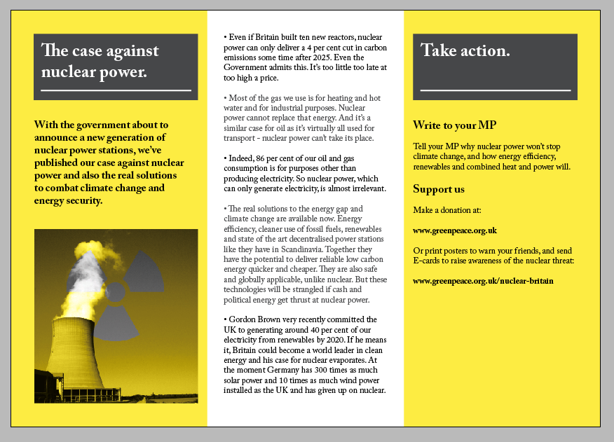
Leaflet print - mock -up
Needs some alteration of the margins and gutters to make the body copy fit right, Quite pleased with the first mock-up though. I will mark all the changes needed and re-print.
I have also added an image of the poster, postcard and leaflet together.


I have also added an image of the poster, postcard and leaflet together.


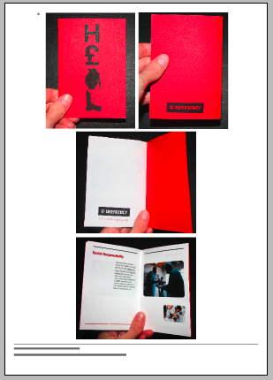
nuclear power leaflet development.


Showing the development of the layout arrangement for a leaflet to encourage people to support the campaign against nuclear energy with Greenpeace, this leaflet goes with the posters, postcards, E-card and web page I have also designed. The graphic style is the same through out focusing on photographic duo-tone images.


nuclear power website ecard test...
website ecard test... Here is a quick mock up of the idea for an ecard, a simple animated sequence that leads the audience to two options playing the card again or taking action which leads them to the options on the greenpeace spreading the message and leading more people to the website etc.

This one is 2 seconds in between frames I also test 1 second in between farames aswell and I think 1 second frames works best. This test repeats for viewing purposes on my blog but the final ecard will stay on the final greenpeace screen til the viewer selects one of the two options.


This one is 2 seconds in between frames I also test 1 second in between farames aswell and I think 1 second frames works best. This test repeats for viewing purposes on my blog but the final ecard will stay on the final greenpeace screen til the viewer selects one of the two options.


Monday, 26 April 2010


Friday, 23 April 2010
Postcard development for nuclear power campaign
Some experiments in photoshop with the layers, some images work better than others, i think the cooling tower image is the strongest as the contrast between the yellow and the symbol is really clear.


Subscribe to:
Posts (Atom)