
Wednesday, 28 April 2010
final brief number 2 - Information access logo
This brief is another educational sector brief, I want to focus on more than just publications for my design work so I thought this would be a quick brief I could work on that will have clear concept development and I get to play around with type more closely rather than dealing with lots of body copy.

Tuesday, 27 April 2010
Final brief ideas...
I am continuing focusing my work down to what type of designer I want to be. From my context research and previous briefs I have narrowed down my interests to type and layout design that communicates social, health and educational issues.
To demonstrate this in my work and portfolio I feel one of my final briefs should cover an educational issue as I have focused on the other two areas in previous briefs, like the important issues briefs - which consisted of a campaign against nuclear power, awareness for fair health care endorsed by EMERGENCY, Climate change campaign for WWF and 3 minutes which was based for the NHS.
I want to make sure I cover at least some of each area of the things I am interested in as a designer. The image below show the brief I have drafted out that can lead me through my final weeks of my FMP. Bringing together my range of briefs under the theme mentioned above of type and layout... etc.
I am having a tutorial tomorrow so I will be discussing my proposed brief and my progress on my FMP so hopefully this will give me the added confidence in the direction I am going in.

Greenpeace - on nuclear power - website development
Here are some mock ups of the graphics added to the existing website for Greenpeace. The first design uses the font from the rest of the campaign material while the second example uses a font more fitting to the existing type on the webpage. I think the san serif type works better and the designs as a whole are more intergrated to the existing style of Greenpeace website.


Leaflet print - mock -up
Needs some alteration of the margins and gutters to make the body copy fit right, Quite pleased with the first mock-up though. I will mark all the changes needed and re-print.
I have also added an image of the poster, postcard and leaflet together.


I have also added an image of the poster, postcard and leaflet together.


nuclear power leaflet development.


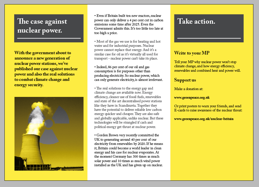


Showing the development of the layout arrangement for a leaflet to encourage people to support the campaign against nuclear energy with Greenpeace, this leaflet goes with the posters, postcards, E-card and web page I have also designed. The graphic style is the same through out focusing on photographic duo-tone images.


nuclear power website ecard test...
website ecard test... Here is a quick mock up of the idea for an ecard, a simple animated sequence that leads the audience to two options playing the card again or taking action which leads them to the options on the greenpeace spreading the message and leading more people to the website etc.

This one is 2 seconds in between frames I also test 1 second in between farames aswell and I think 1 second frames works best. This test repeats for viewing purposes on my blog but the final ecard will stay on the final greenpeace screen til the viewer selects one of the two options.


This one is 2 seconds in between frames I also test 1 second in between farames aswell and I think 1 second frames works best. This test repeats for viewing purposes on my blog but the final ecard will stay on the final greenpeace screen til the viewer selects one of the two options.


Monday, 26 April 2010


Friday, 23 April 2010
Postcard development for nuclear power campaign
Some experiments in photoshop with the layers, some images work better than others, i think the cooling tower image is the strongest as the contrast between the yellow and the symbol is really clear.


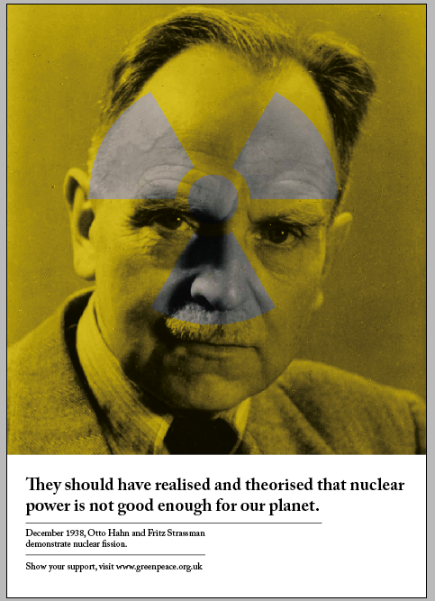
Postcards images for nuclear power campaign


Here are some images I am going to experiment with for some postcard ideas, I thought using a variety of images throughout the campaign will make it more interesting and understandable to the audience alongside the scientist posters. To have consistency throughout the campaign materials I will be using the nuclear symbol throughout and see if this is successful. The postcards will be mailed out along with the poster, with the back of the postcard asking for the recievers help and directing them to the Greenpeace website.
Thursday, 22 April 2010
Greenpeace - on nuclear power - poster development
I decided to add the type to one of the test images to see how the photography and type could work together, not quite sure which is the most successful myself, I've been working a bit too closely to them so I'm going to ask around and get some other people's feedback...


Subscribe to:
Posts (Atom)